
In today’s digital landscape, having a website that looks fantastic on desktop but falls apart on mobile devices is a common challenge. If you’re tired of spending hours adjusting pixel values and want a seamless, automatic solution for responsive web design, you’ve come to the right place.
Welcome to Virginia Web Design’s comprehensive guide on responsive web design! In this post, we’ll delve into the world of relative units and their role in creating mobile-friendly, visually appealing websites that work flawlessly across all devices.
Understanding Relative Units: The Key to Responsive Design
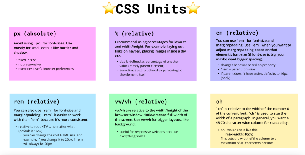
Have you ever encountered the frustration of a beautifully designed website on desktop that turns into a mess on mobile? The culprit often lies in using absolute units like pixels (px) that don’t adapt well to varying screen sizes. Enter relative units, such as VW, VH, EM, and REM.
EM and REM: These units scale according to their parent element’s font size. EM is relative to the parent, while REM is relative to the root element. This makes them perfect for font sizes, providing consistent scaling across devices.
VW and VH: Viewport Width (VW) and Viewport Height (VH) are percentages of the screen width and height, respectively. This means your design adjusts automatically, ensuring consistency and responsiveness.
Putting Relative Units into Action
When it comes to font sizes, ditch fixed values and embrace EM and REM units. Set a default font size and watch your website adapt effortlessly to various screens. Columns, margins, padding, and sections benefit from percent values, maintaining proportionality as users switch devices.
Unlocking the Power of Mobile Responsive Design
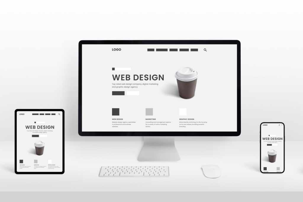
Viewport units (VW and VH) revolutionize mobile-responsive design. They automatically adjust content to fit the user’s screen, eliminating the need for manual tweaks. Imagine your website looking impeccable on a smartphone, tablet, and desktop without the pixel-perfect struggle.
Why Virginia Web Design Is Your Responsive Web Design Partner
At Virginia Web Design, we understand the importance of a mobile-friendly website in today’s fast-paced world. Our expert team specializes in crafting visually appealing and highly functional websites that deliver an unforgettable user experience. We pride ourselves on using innovative solutions like relative units to ensure your website looks great across devices.
Conclusion: Elevate Your Online Presence with Responsive Design
Responsive web design is no longer a luxury—it’s a necessity. In a world where users access websites on various devices, ensuring your site looks and functions flawlessly is crucial. By leveraging relative units like EM, REM, VW, and VH, you can create stunning, mobile-friendly websites that leave a lasting impact.
Are you ready to enhance your online presence and engage users on any device? Virginia Web Design is your trusted partner in crafting websites that reflect your brand’s essence and drive business growth. Contact us today for a free consultation and take your web design to the next level.
Remember, in the realm of responsive web design, relative units are your best allies. Embrace them, and watch your website transform into a seamless, user-friendly experience for all.
Empower your business with Virginia Web Design – a leading web agency based in Centreville, VA, delivering custom web solutions and targeted SEO strategies that elevate your online presence across the entire state of Virginia.